Financial .
Management Dashboard ///

Overview  ///

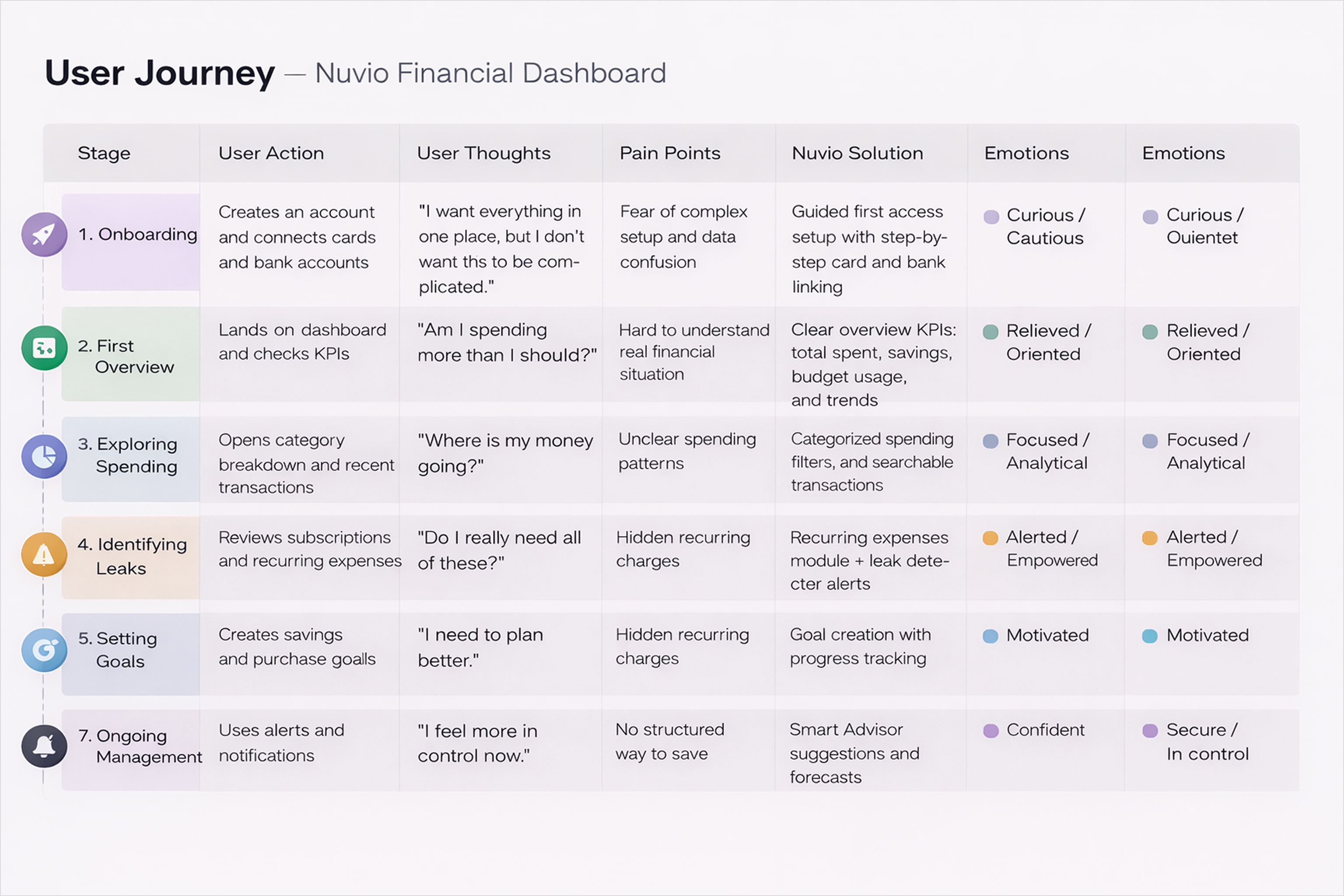
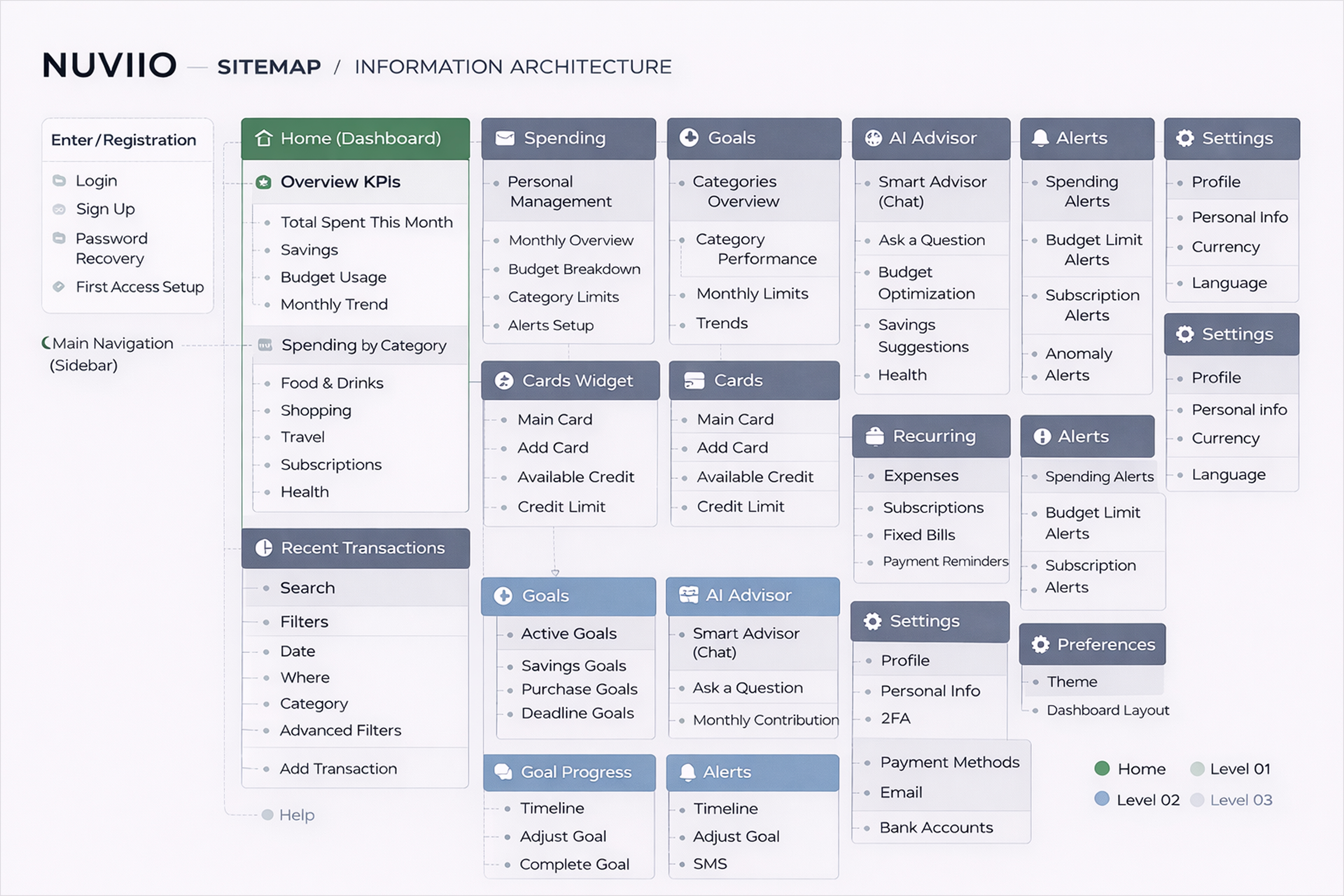
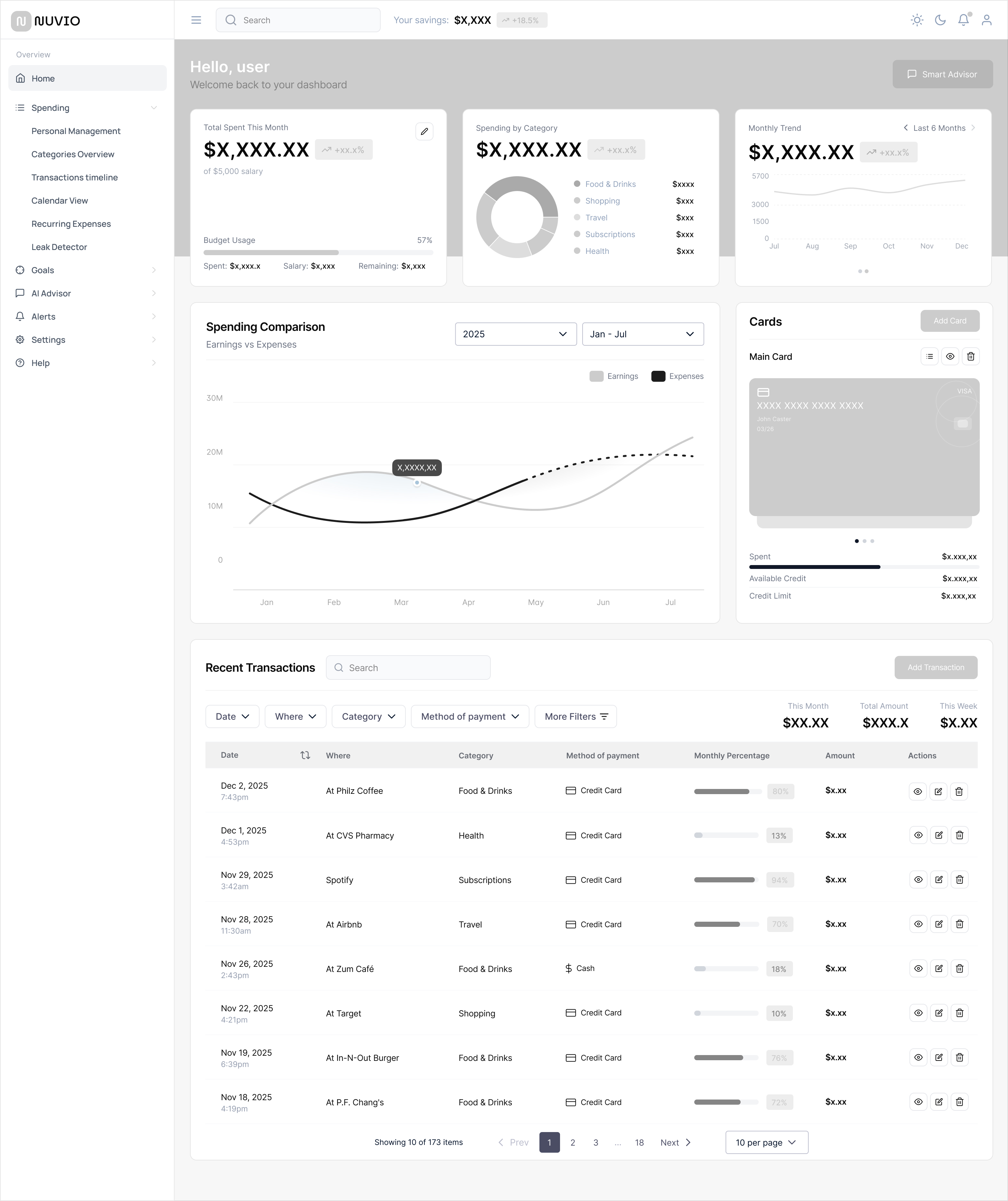
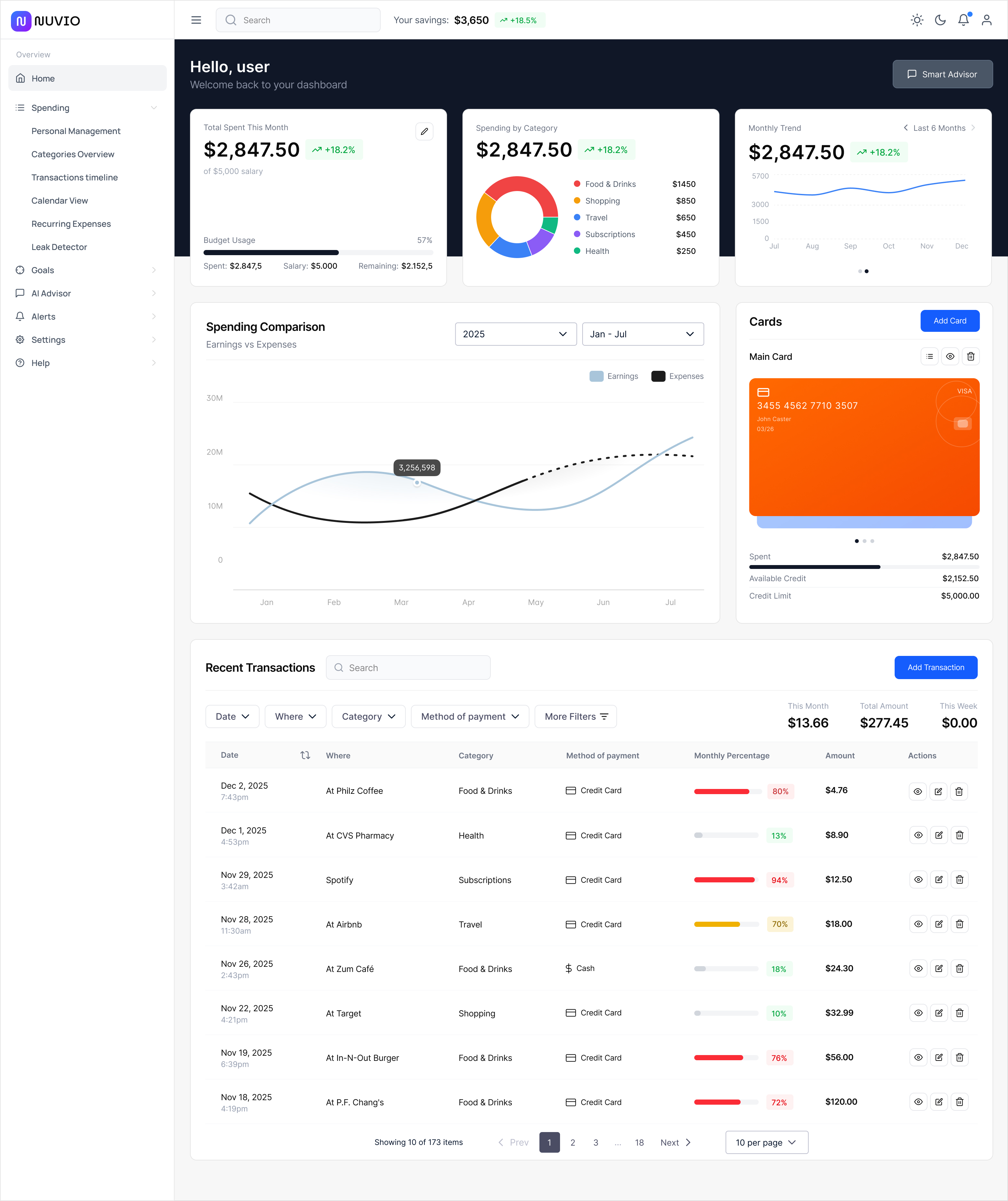
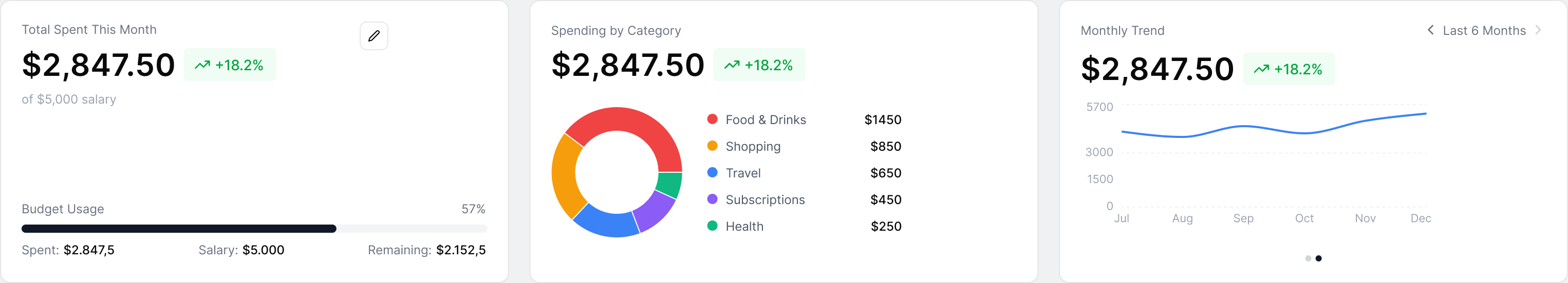
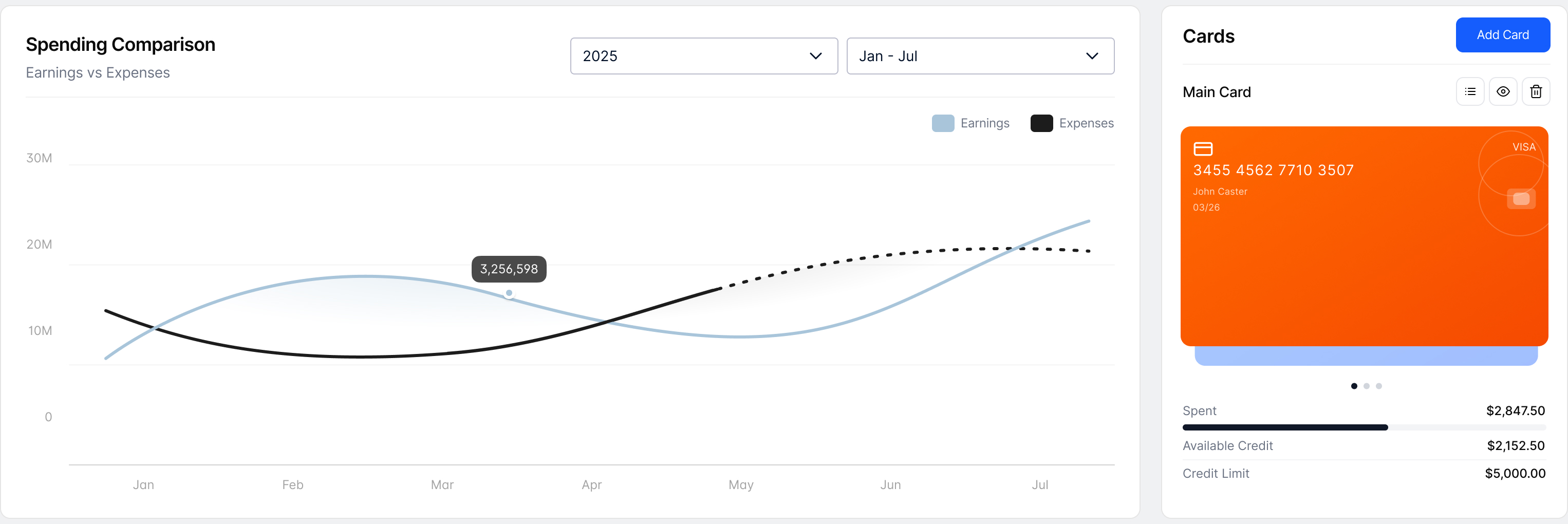
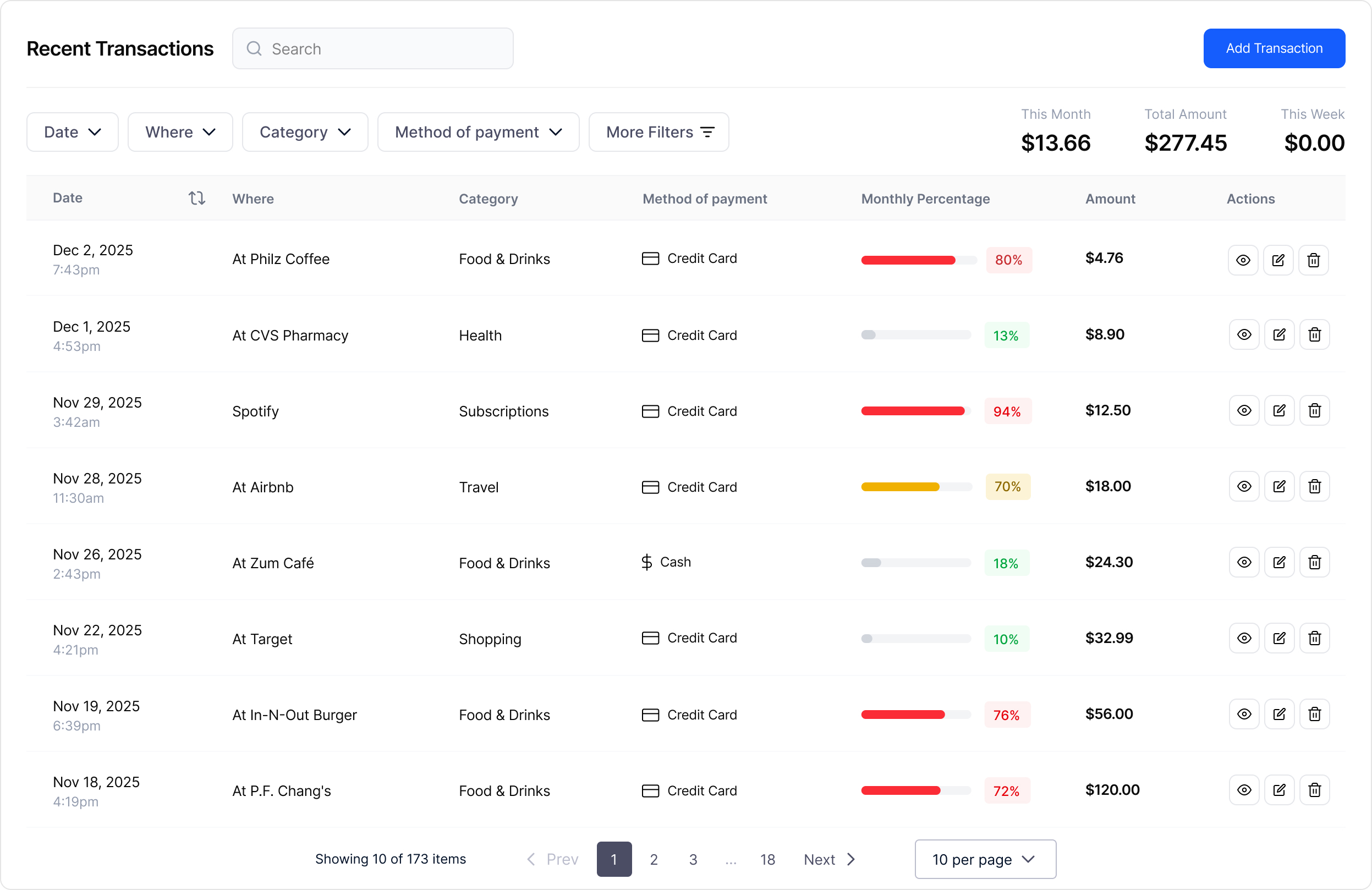
With a strong background in designing dashboards and data-driven interfaces, I saw in this project an opportunity to consolidate my experience into a complete financial management product. This motivation led me to design Nuvio, a personal finance dashboard focused on clarity, data visualization, and decision-making support. Throughout the design process, I analyzed common behaviors found in budgeting and banking apps, identifying friction points related to navigation, data overload, and lack of actionable insights. Based on these observations, I structured a product that organizes financial information into clear layers, prioritizing key metrics, spending behavior, and goal-oriented views. Below, I present the main interface decisions, structural solutions, and UX strategies applied to Nuvio, aiming to transform raw financial data into meaningful, accessible, and decision-driven experiences.

Role  ///

UX/UI Design . 

Date  ///

December 2025

The project itself

General Overview  ///

Nuvio is a financial management dashboard designed to centralize, visualize, and organize personal financial data in a clear and structured way. It enables users to track spending, monitor budgets, manage cards, and analyze trends through data-driven visualizations.The product focuses on simplifying complex financial information into actionable insights, allowing users to understand their financial behavior, identify patterns, and make better decisions. The interface is optimized for clarity and scalability, supporting both quick overviews and deeper analytical exploration.

Concept

Managing personal finances across multiple cards, accounts, subscriptions, and recurring expenses often leads to fragmented information, limited visibility, and difficulty understanding real spending behavior. This lack of centralized and structured financial data makes it harder for users to track budgets, identify patterns, and make informed financial decisions.

Goal

Design a financial management dashboard that centralizes personal financial data into a single, intuitive platform, allowing users to monitor spending, manage cards, track subscriptions, and analyze financial trends in real time. The product aims to improve financial awareness, support budgeting strategies, and enable more confident, data-driven financial decisions.

Pain points  ///

Fragmented financial information

Personal financial data is often spread across multiple banks, cards, and apps, making it difficult for users to have a clear and consolidated view of their real spending behavior, balances, and financial commitments.

Limited visibility into spending patterns

Without structured visualizations and categorized data, users struggle to identify trends, recurring expenses, and categories that impact their budget the most, reducing their ability to make informed financial decisions.

Lack of actionable financial insights

Most financial tools focus on displaying raw numbers rather than providing meaningful insights, alerts, and recommendations, leaving users without clear guidance on how to optimize spending, manage subscriptions, or improve savings strategies.

User Journey  ///

This is the journey map designed for users of Nuvio, the financial management dashboard. It outlines the key stages, actions, thoughts, pain points, and emotions experienced by users while interacting with the platform — from onboarding to ongoing financial control. The map illustrates how users understand their finances, identify spending patterns, detect leaks, set goals, and progressively gain clarity, confidence, and control over their financial life.

Starting the Design

App map  ///

It's a structured scheme that outlines the pages and content hierarchy of the app.

Digital Wireframes  ///

High Fidelity Elements  ///

Outcome  ///

What can be used as learning

Now, finally, it remained to pay attention to several takeaways and plan some further steps.

Takeways

Users face difficulties not only in understanding their financial behavior, but also in navigating complex and fragmented financial content. Organizing different types of data, transactions, categories, subscriptions, goals, and alerts, in a clear and approachable way is a major challenge, especially for non-expert users, directly impacting confidence and decision-making.

What I learned

Designing Nuvio showed how essential visual planning, content hierarchy, and intuitive interaction design are when dealing with complex financial information. Clear layouts, progressive disclosure, and friendly micro-interactions significantly improve comprehension, reduce cognitive load, and make financial management accessible even for non-specialist users.

Feedbacks to improvement

Future improvements should be guided by continuous monitoring of product metrics, user behavior, and performance data, combined with constant user feedback collection. These insights will support data-driven interface refinements, ensuring that design decisions are based on real usage patterns, usability evidence, and measurable impact — leading to a continuously improving and more effective financial experience.

Previous project ///

Pyxys Corporate Website

Previous project ///

Tolk 2 me