Diagnosis
System Diagnosis ///
An audit of the platform revealed duplicated components, inconsistent spacing and typography, hard-coded colors, missing accessibility states, and multiple visual interpretations of the same interactions.
This diagnosis confirmed that the product had evolved without a system layer, creating long-term scalability and maintenance risks.
Before the components
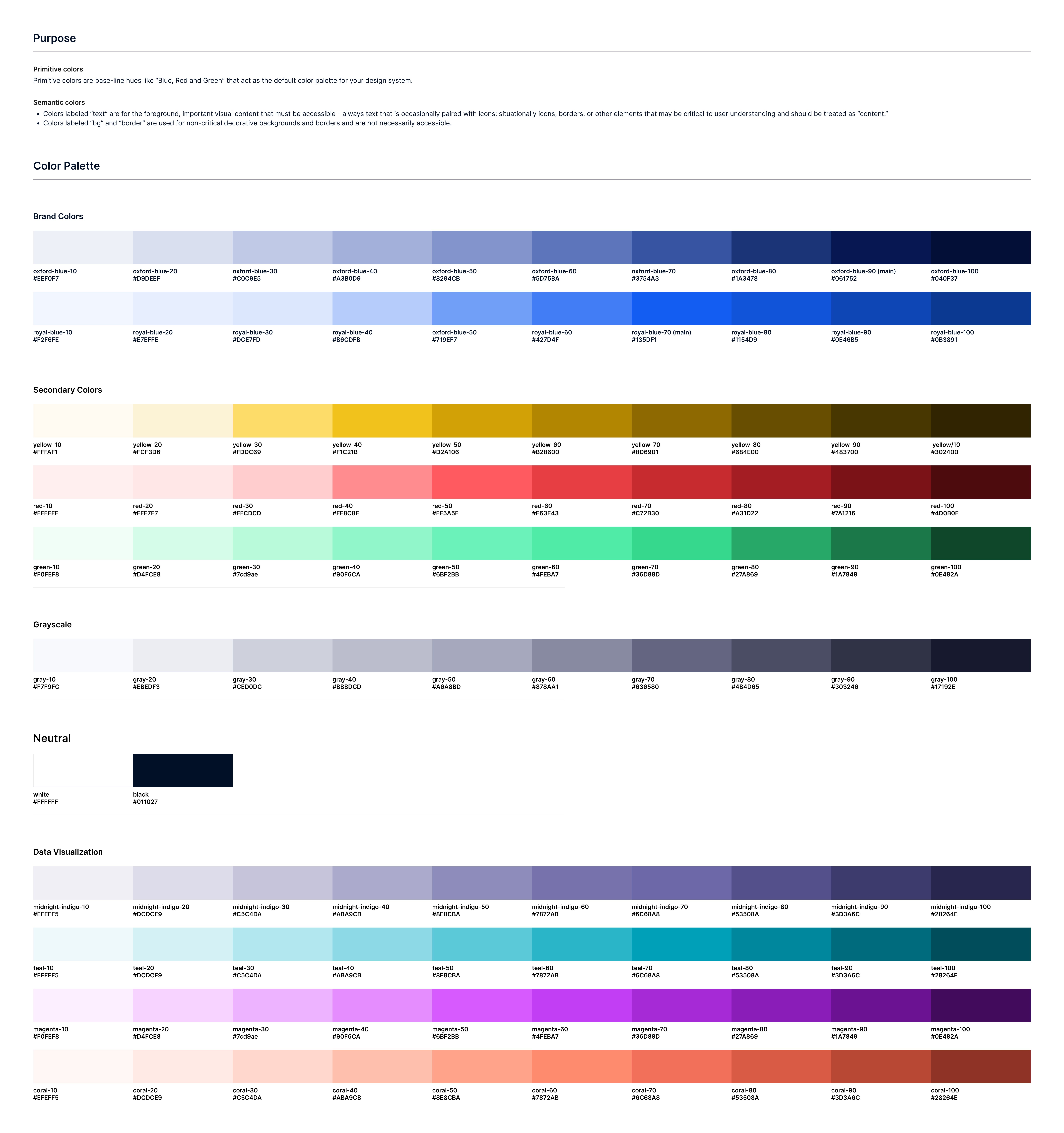
System Strategy ///
The strategy was to build the Design System from foundations first — defining color, spacing, typography, layout rules, and accessibility standards — before creating components.
This approach ensured that every component would be built on top of a predictable, scalable, and maintainable token architecture.
Architecture
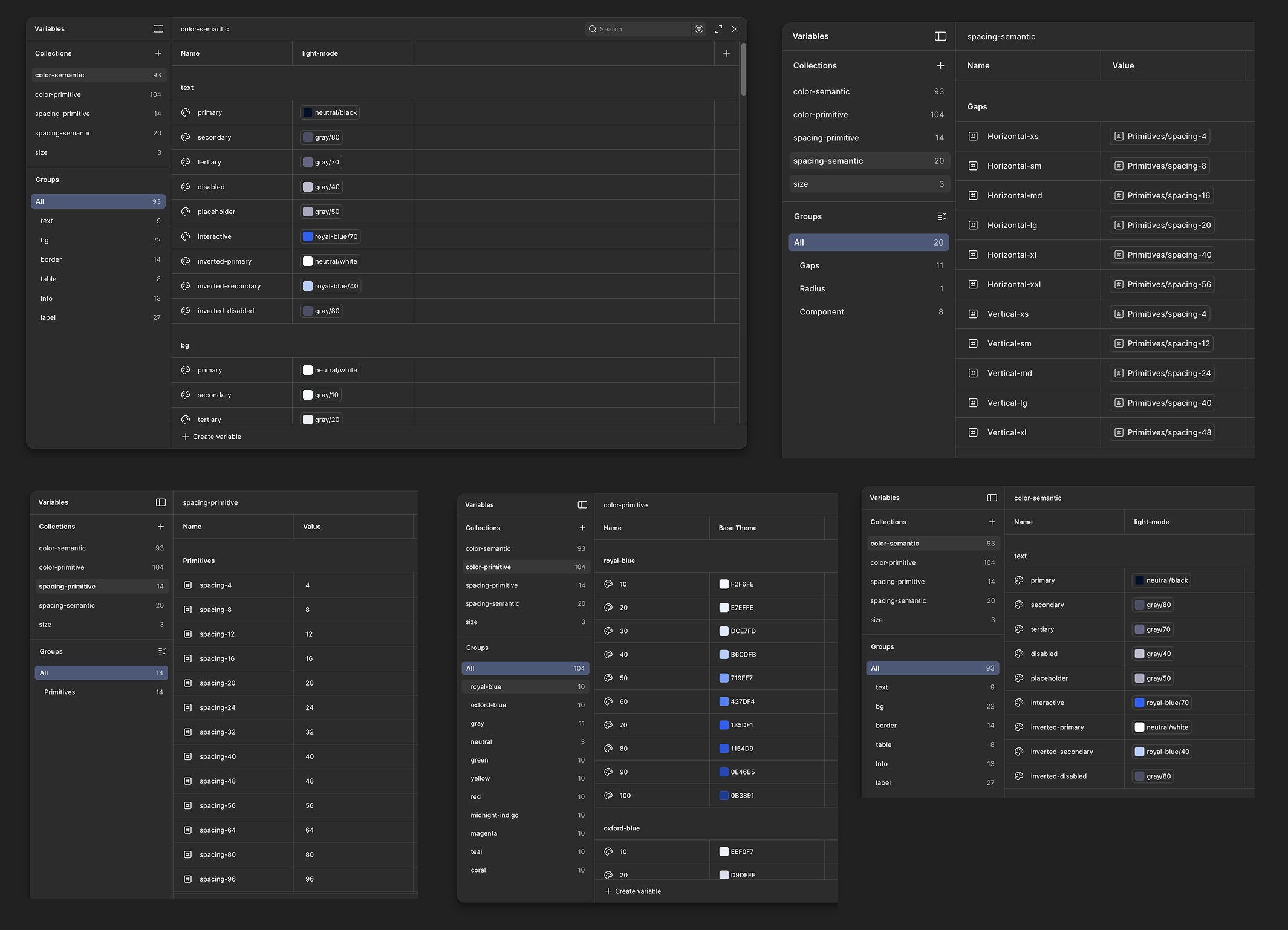
System Architecture ///
The system was structured into foundations, components, patterns, and governance rules.
Design tokens controlled colors, spacing, typography, border radii, and states, enabling global updates, accessibility control, and visual consistency across all products.
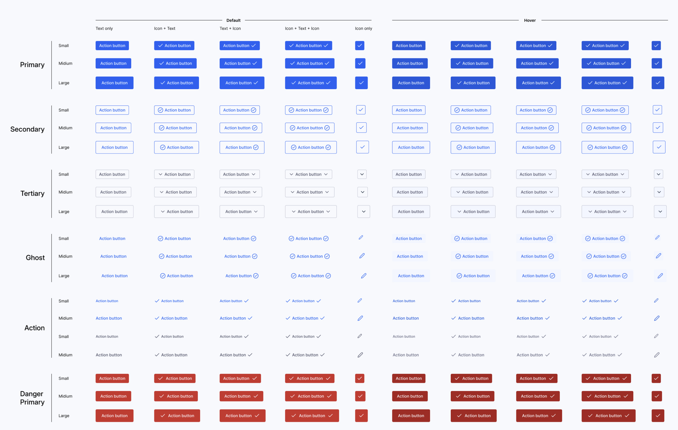
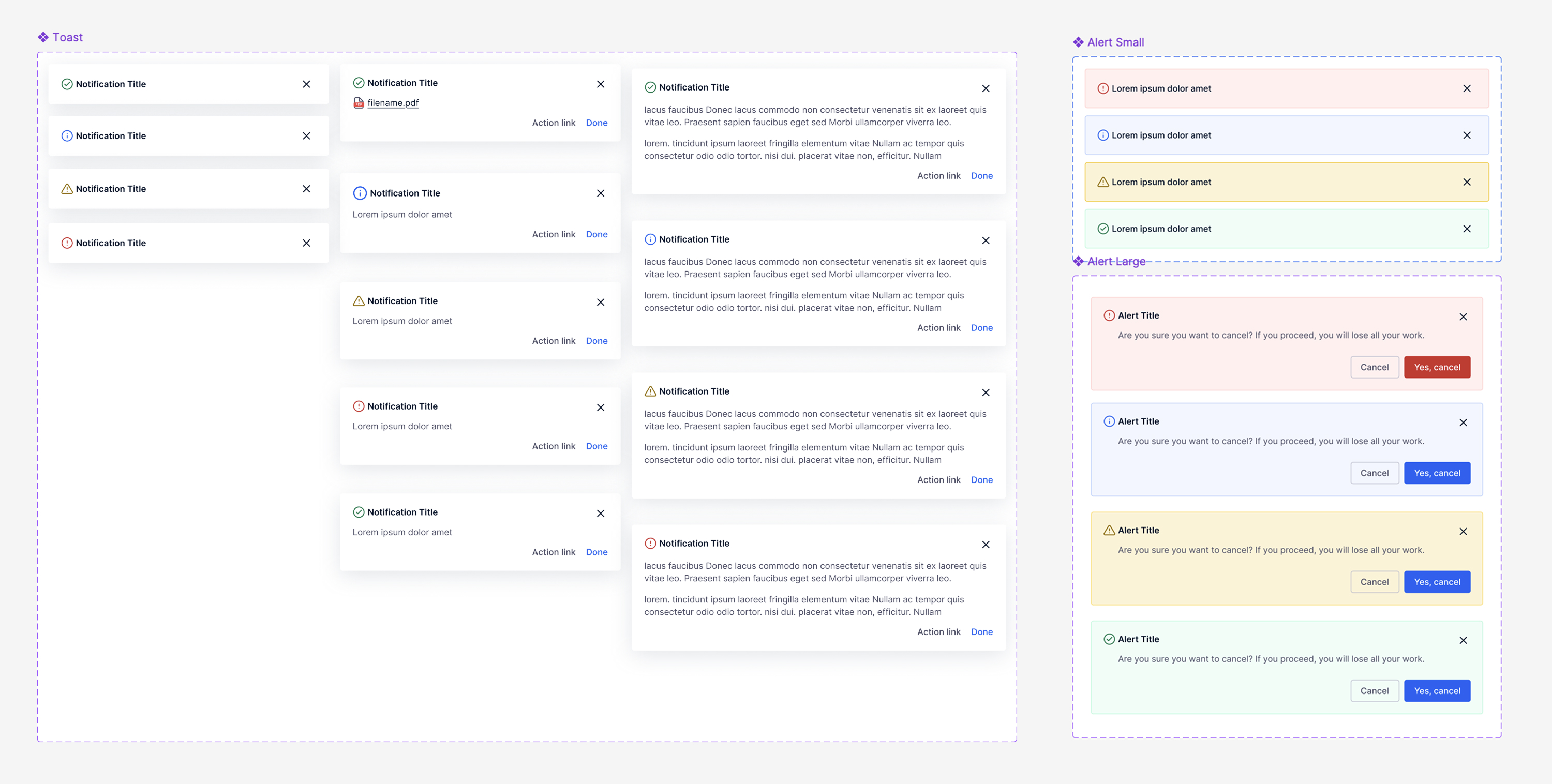
Some Samples ///
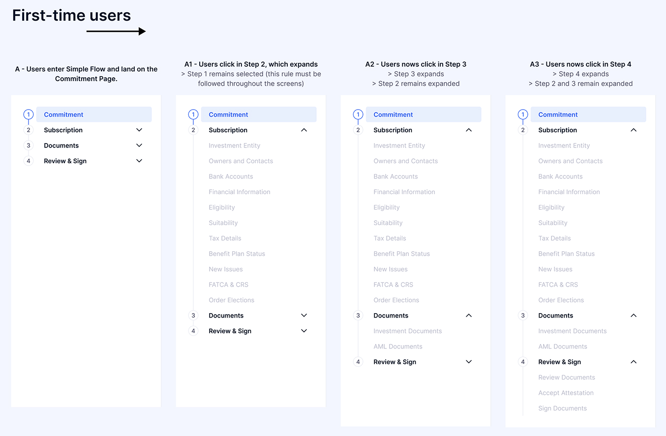
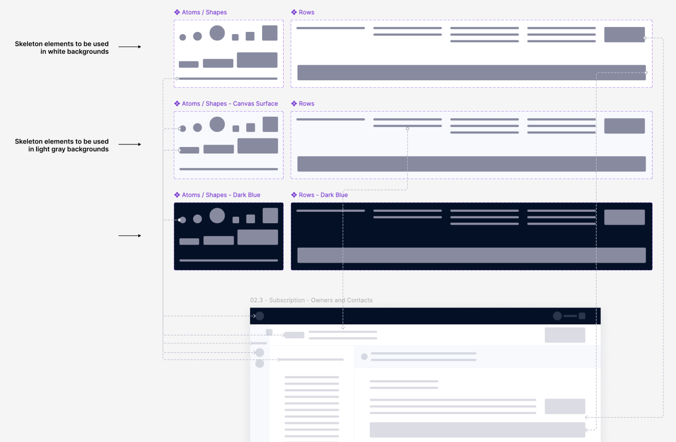
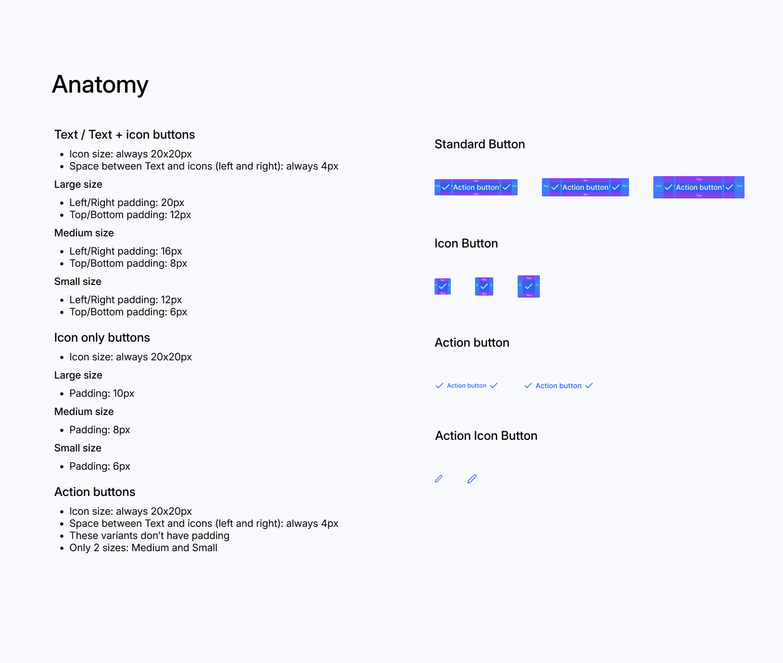
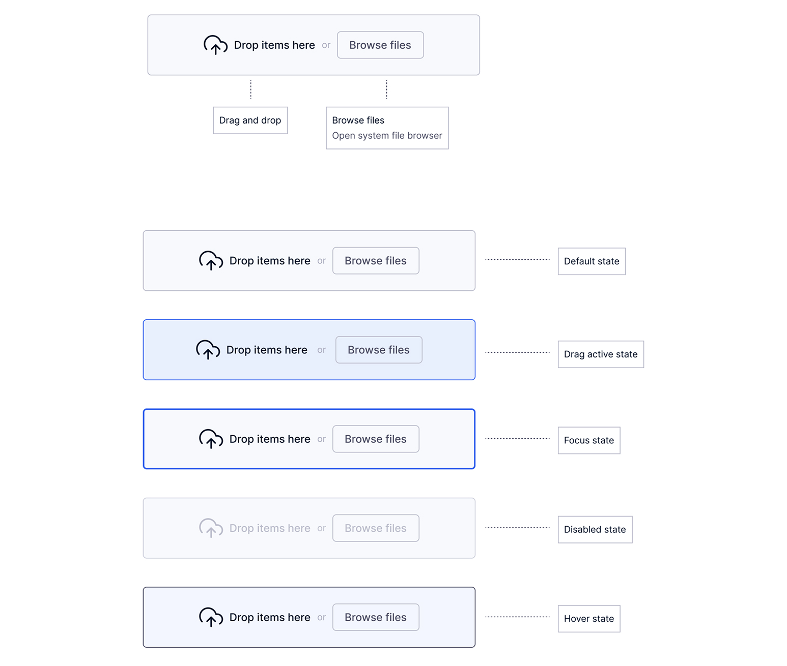