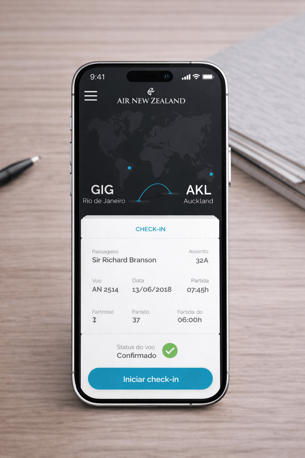
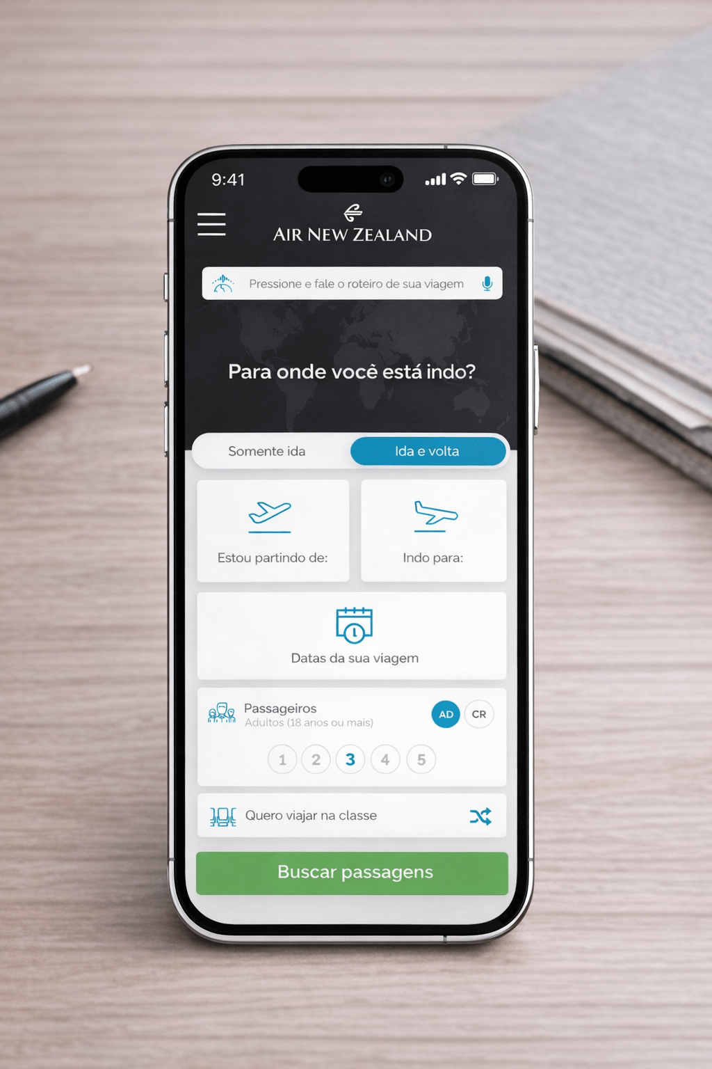
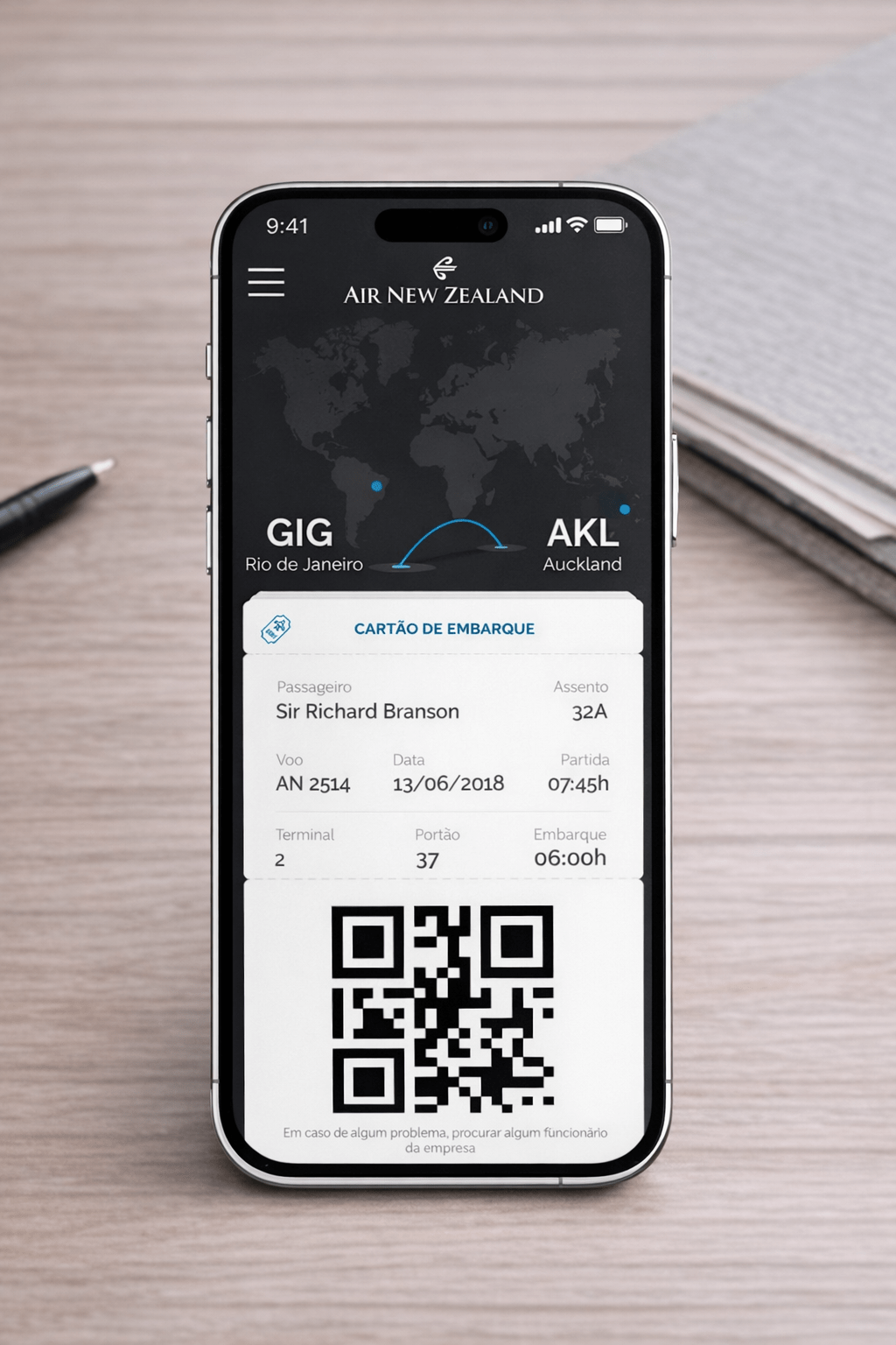
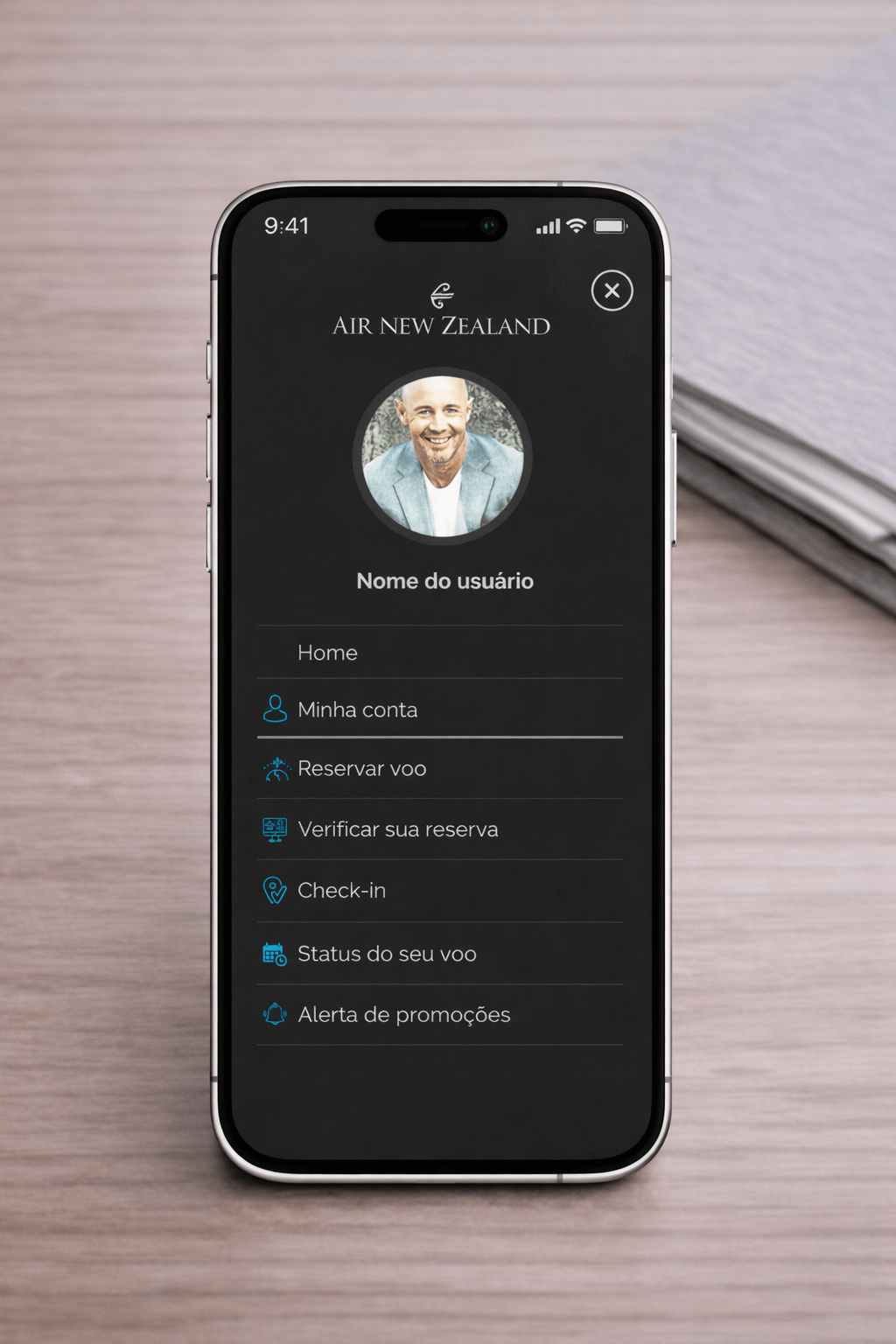
What was found and its proposals ///
Problems and what was thought to fix them
Booking page flow ///
A – Problem
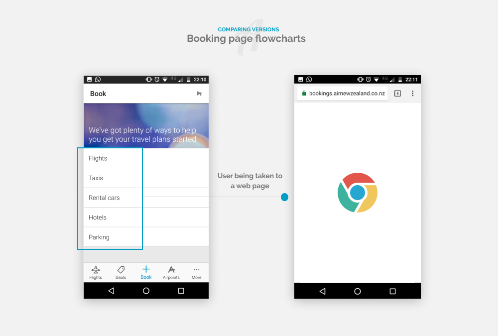
The most critical fact I considered was the internal flows in the "Book" tab, where,
without exception, all clicks lead to pages outside the APP. In this case, leading to a
browser page. This was the first airline APP I used that made such a flow.

B – Solution
While navigating through the APP, in addition to the problem described above, I also
identified that all the services of these links are from the airline itself. That means, all
of them could be solved within the APP, which would generate a sense of security for
the user, by having the perception of always being in the same place, and without the
feeling of "Uh, what happened? I left the app?", which could impact directly in the
purchase of the ticket or the hiring of services.
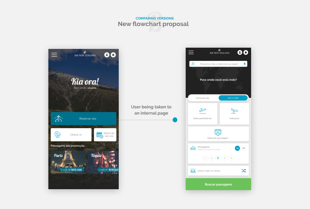
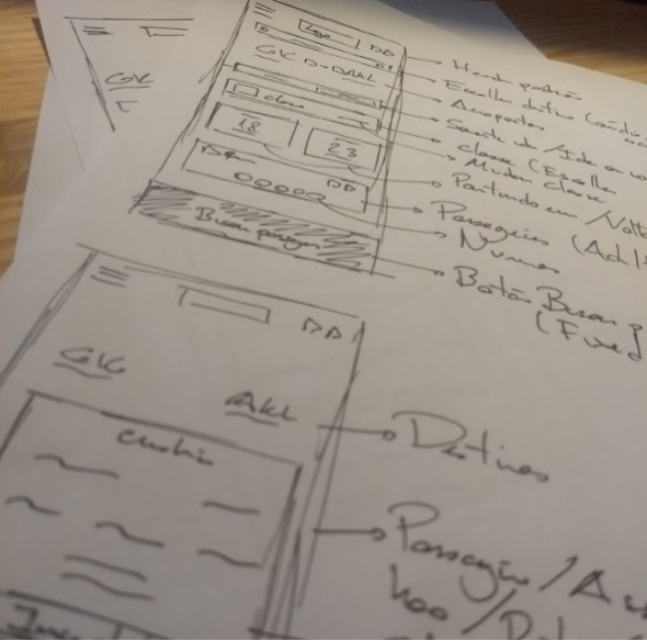
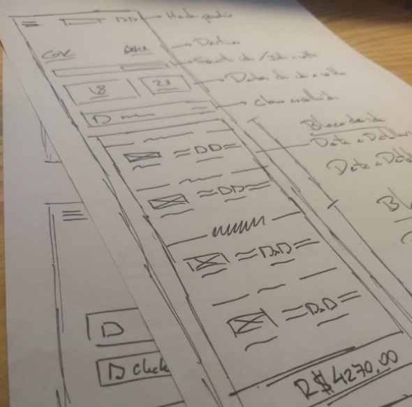
In the image on the right, is illustrated the flow of flight reservation, with Click on
"Book flight" and the screen within the APP.

Improvement 01 ///
Login Access Improvement
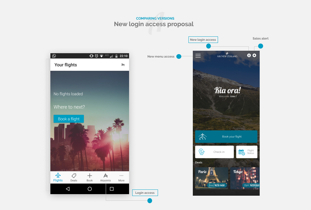
The login screen of the APP is in a more intuitive area, both in terms of taxonomy and
location.
There is no button, link or default icon identifying the login in the APP, the user needs
to understand the login is done through the name “Airpoint” of the miles program.
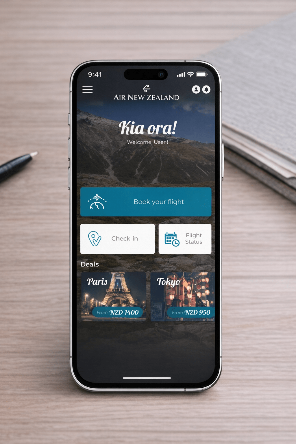
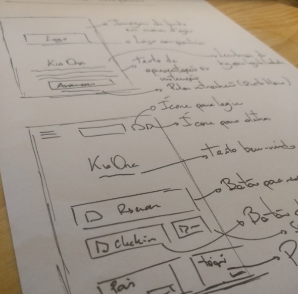
The solution, as seen in the image, was to place a user icon right on the home page,
as its used by many APP’s.

Improvement 2 ///
Visual language
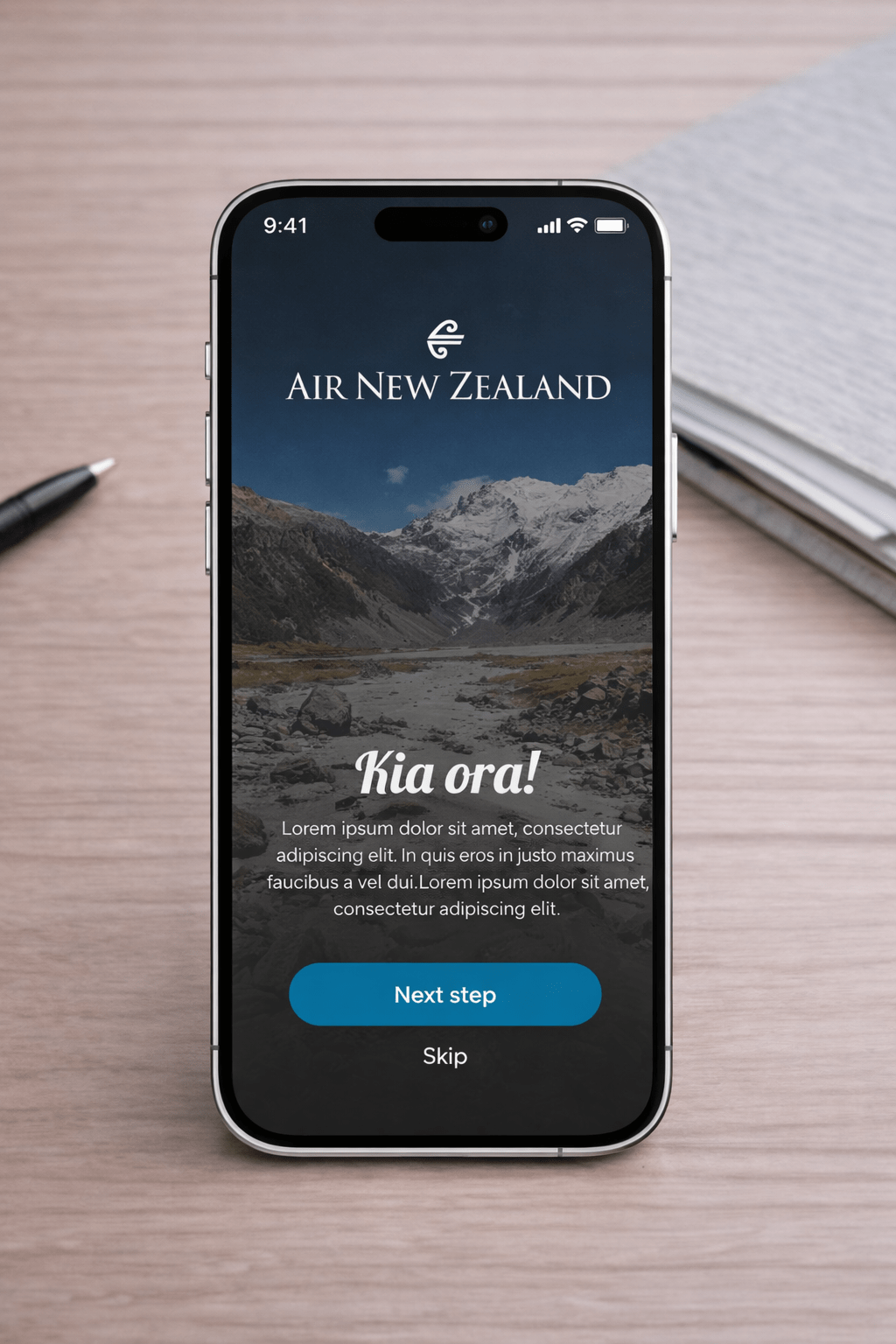
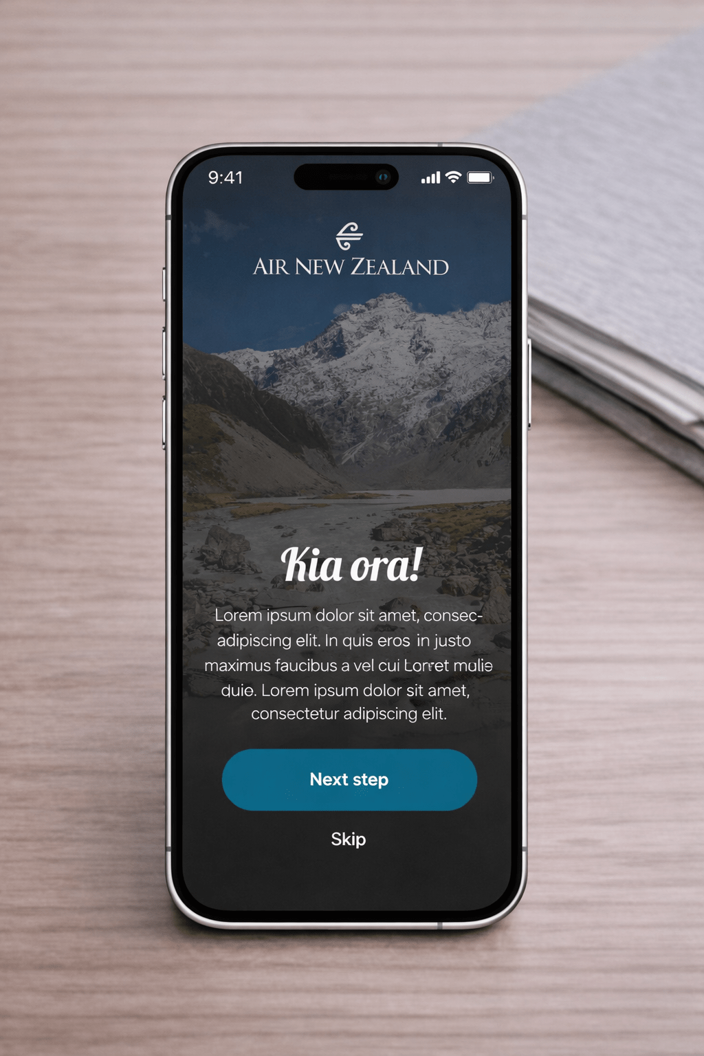
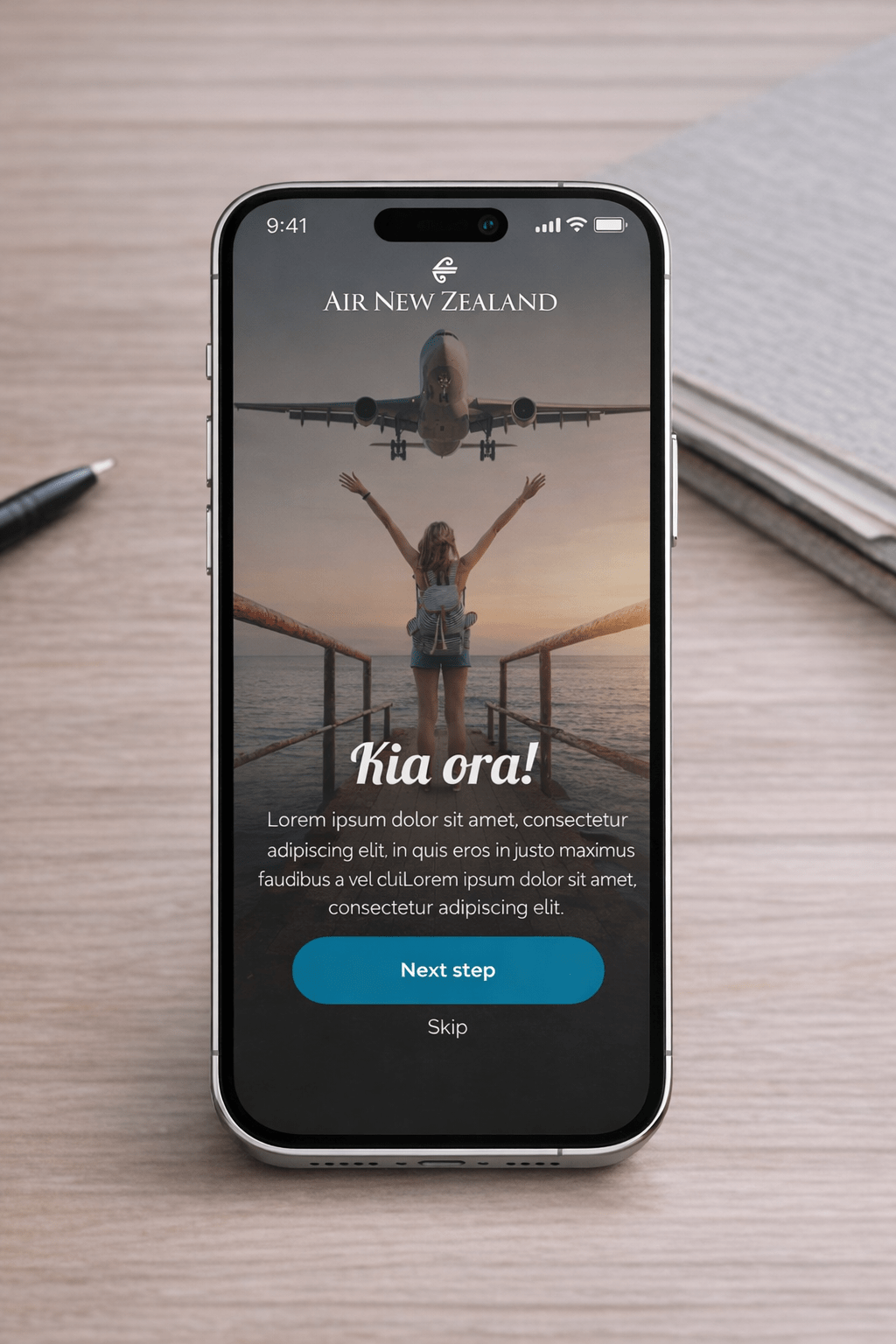
As mentioned before, I considered that the visual language of the APP does not match
at all what New Zealand offers, especially in terms of natural beauty. As subjective as
it may be, I think the layout of the APP is very rigid, besides having a language that
resembles to an old APP.
As a main improvement, my idea was to redesign the APP with visual language more
modern, using whenever possible photographs of the country, with less hard and
more rounded type fonts (as well as boxes), giving an idea of informality.
And the repositioning of the lower tab, which was passed to a side menu, being
accessed by a click on a standard icon.
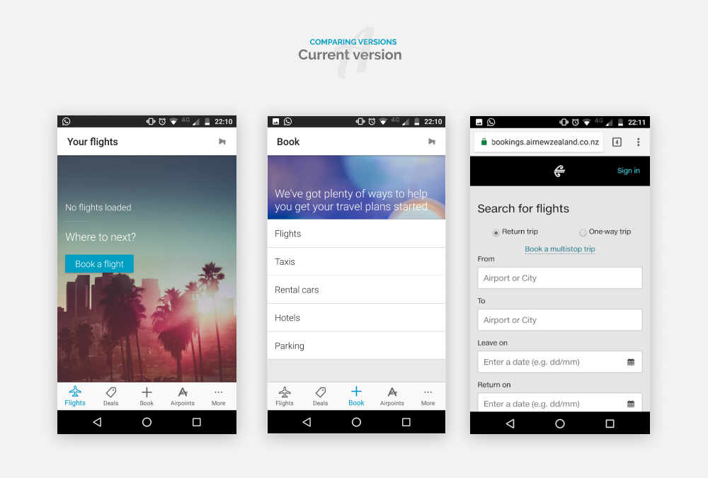
Current Version

New Version

Architecture information ///
After bug reviews and improvements
Global navigation
- Book flights
- Flight status
- My bookings
- My account
- Promotions alert
Local Navigation
- Round trip (Depart/Arrive) or One way
- Dates
- Passengers
- Cabin (economy/premium economy/business/first)
- Find flights / Flights results
- Tracker
- Profile
- Bagged information
- Boarding pass
- All boarding passes
- City residence
- Alert Options
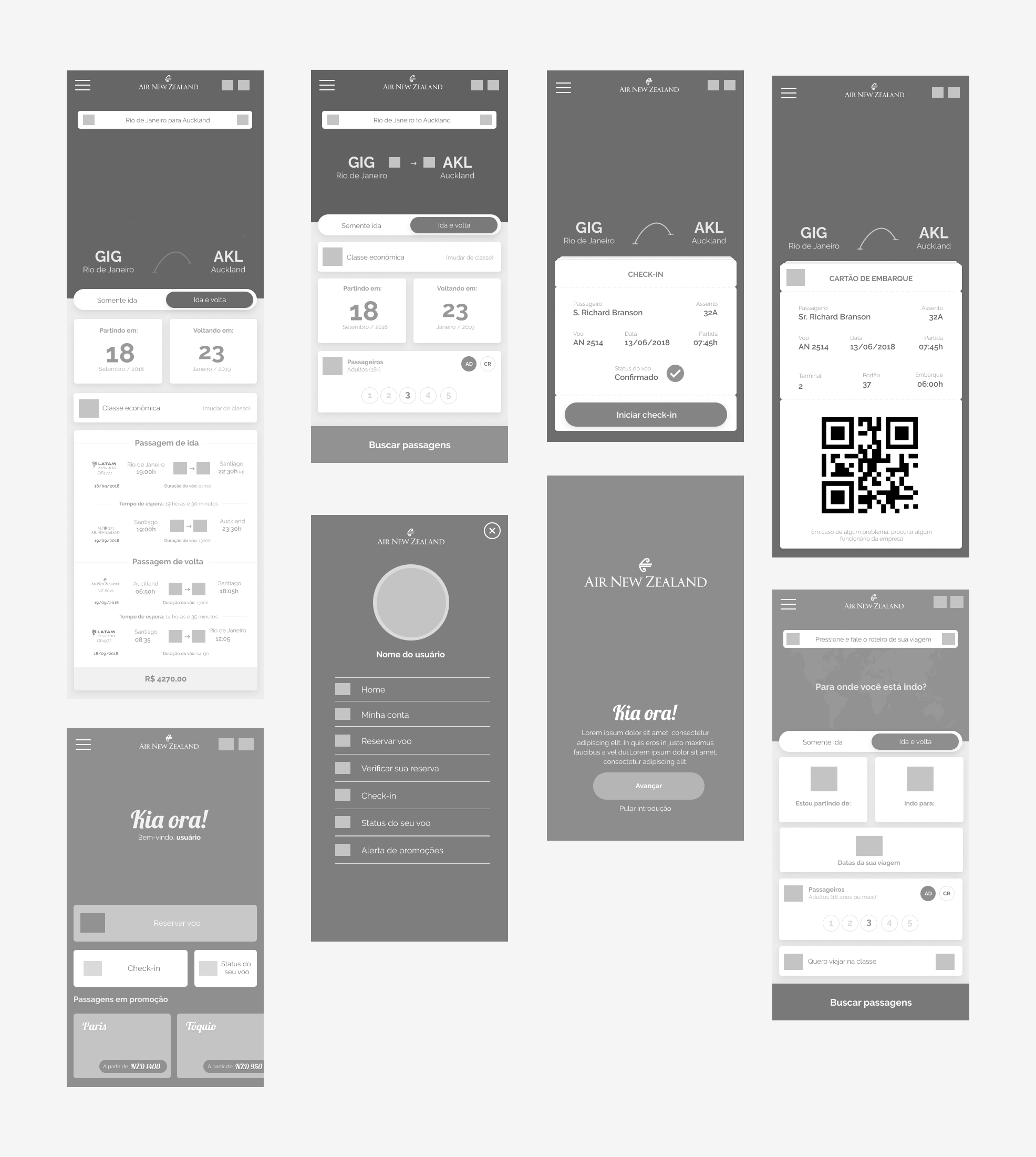
Wireframes ///
Placing on the interface


